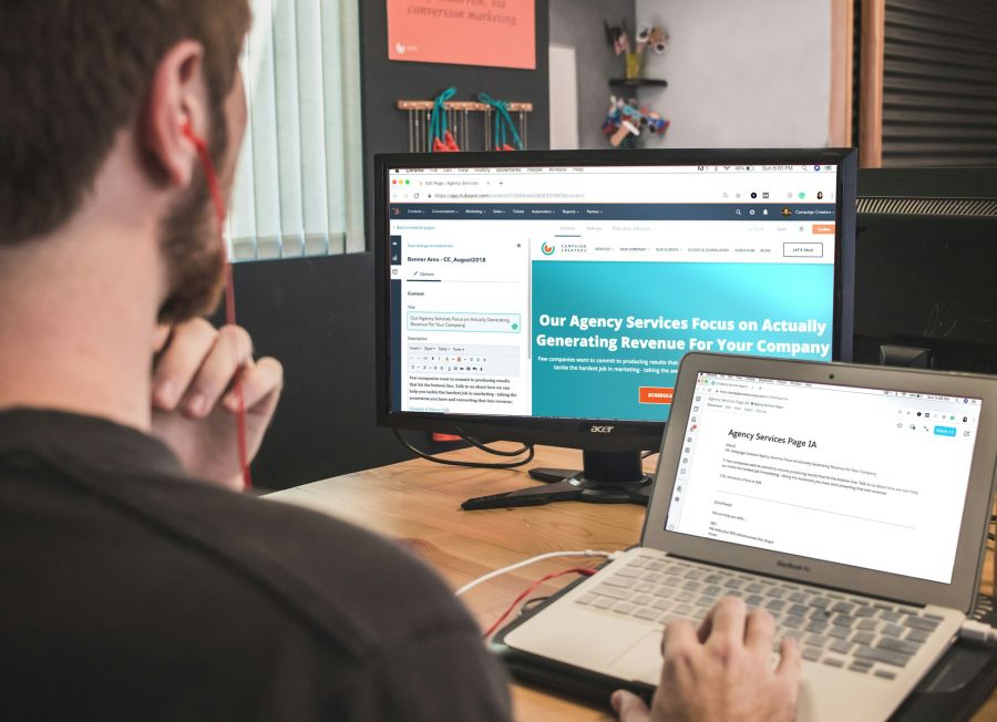
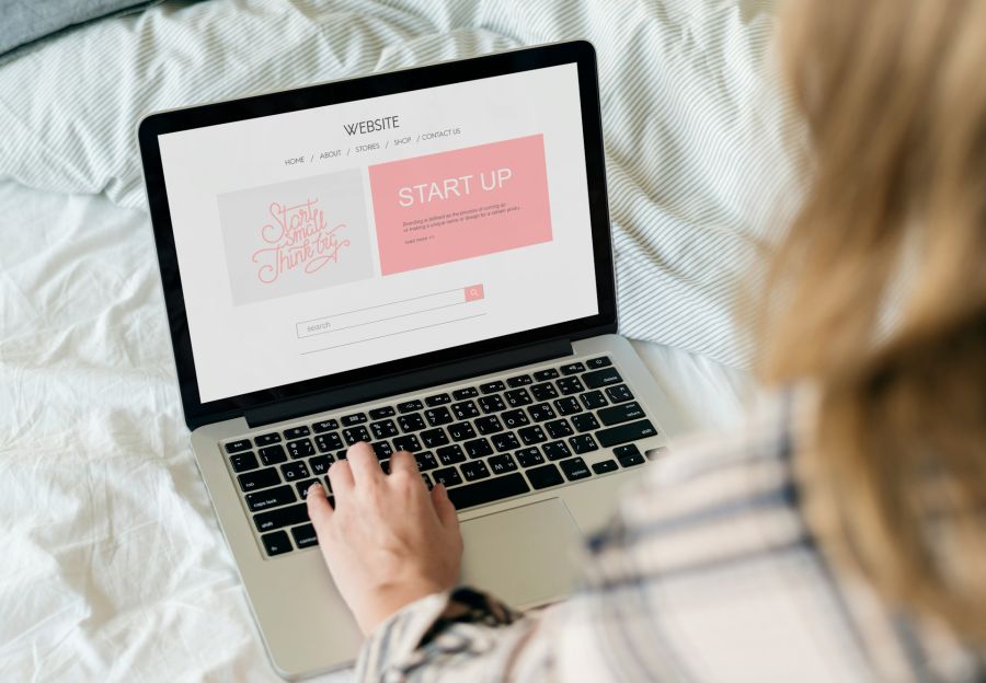
When you think about web design, it's easy to focus on how a site looks. However, to create a truly meaningful online experience, it's crucial to consider functionality and user experience as well. A stunning design from BK Design Solutions won't have the desired impact if visitors struggle to navigate the site or if it lags. Achieving the right balance between aesthetics and usability is essential. So, what factors should you prioritize to ensure your design resonates with users? By partnering with BK Design Solutions, you can be confident that your website will not only look great but also function seamlessly, providing an exceptional experience for your visitors.
Functionality Enhances User Satisfaction

When you consider your website's success, remember that functionality plays an essential role in enhancing user satisfaction. At BK Design Solutions, we understand that effective web design hinges on seamless usability, which directly impacts user experience.
With our expertise in creating efficient navigation and fast loading times, we can help you drastically reduce bounce rates and boost engagement on your site.
Our expertise in navigation and loading speeds significantly lowers bounce rates and enhances site engagement.
Our clear calls-to-action (CTAs) are designed to elevate conversion rates by over 200%, guiding users toward desired actions. Additionally, we implement user-friendly features, such as streamlined checkout processes, which can cut cart abandonment rates by 30%.
For mobile users, we ensure swift load times—an essential factor, as 53% of users will leave if a site takes longer than three seconds. By choosing BK Design Solutions, you prioritize functionality, improve user satisfaction, foster loyalty, and drive business success. Our SEO-friendly websites are an integral part of creating a strong online presence that supports these goals.
User-Centric Design Principles

When you prioritize empathy in design with BK Design Solutions, you create experiences that truly connect with users. Accessibility for all means considering the diverse needs of your audience, ensuring everyone can engage with your product. Implementing mobile-friendly design is essential, as it enhances user experience and caters to the increasing number of users accessing websites via smartphones.
Empathy in Design
Empathy in design isn't just an added bonus; it's a fundamental principle that drives user-centric solutions at BK Design Solutions. By truly understanding user needs and perspectives, we create designs that enhance user experience and satisfaction.
Utilizing user personas, our team tailors each approach, ensuring that the functional aspects resonate deeply with your audience. Through usability testing and iterative feedback, we refine our designs based on real user pain points, ultimately fostering emotional connections.
When you incorporate empathy into your design process with BK Design Solutions, you greatly boost user engagement—studies show 70% of users return to a site that feels personalized. Additionally, we leverage real-time traffic updates to ensure our designs not only look good but also function seamlessly in providing essential information.
Embracing empathy in design with us not only elevates user loyalty but also propels business success through innovative, user-centric solutions that truly stand out in the market.
Accessibility for All
How can you ensure that your website is accessible to everyone? At BK Design Solutions, we understand that embracing accessibility in your web design not only enhances user experience but also broadens your audience reach.
By implementing user-centric design principles, such as alternative text for images and keyboard navigation, we improve usability for all users, including those with diverse abilities. Following the Web Content Accessibility Guidelines (WCAG) ensures that your site meets essential functionality standards.
With approximately 15% of the global population facing some form of disability, accessibility is crucial. Accessible websites not only boost user satisfaction and retention rates but also foster brand loyalty.
Ultimately, integrating accessibility into your design isn't just a moral choice—it's an innovative strategy that elevates your brand and connects with a wider audience. Trust BK Design Solutions to help you create an accessible and inclusive website that meets the needs of all users.
Responsive Design for All Devices

Responsive design is essential for optimizing your website across all devices, especially since mobile traffic now accounts for over half of global visits.
At BK Design Solutions, we specialize in ensuring your site adjusts seamlessly to different screen sizes, enhancing the user experience and keeping visitors engaged.
This approach not only boosts user satisfaction but also positively impacts your site's visibility in search rankings.
Trust BK Design Solutions to elevate your online presence through expert responsive design tailored to your needs.
Importance of Mobile Optimization
As mobile devices account for over 50% of global web traffic, ensuring your website is optimized for these platforms isn't just a luxury—it's a necessity that BK Design Solutions can help you achieve.
Our mobile optimization through responsive design enhances user experience by delivering visually appealing content that adapts seamlessly to any screen size. This approach greatly boosts user engagement and satisfaction, keeping users on your site longer and reducing bounce rates, which can soar as high as 70% for non-optimized sites.
Furthermore, Google prioritizes mobile-friendly websites in search rankings, and with BK Design Solutions, you can drive more organic web traffic your way.
Ultimately, implementing mobile optimization with our expert team can elevate conversion rates by up to 90%, making it essential for your online success and fostering meaningful interactions with your audience.
Choose BK Design Solutions for all your mobile optimization needs.
Cross-Device User Experience
In today's digital landscape, partnering with BK Design Solutions to create a seamless cross-device user experience is essential for keeping your audience engaged.
With over 50% of global web traffic coming from mobile devices, responsive design isn't just an option; it's a necessity. BK Design Solutions guarantees that your website adapts effortlessly to desktops, tablets, and smartphones, enhancing usability and functionality.
A well-executed responsive design by BK Design Solutions improves accessibility, catering to diverse screen sizes and resolutions, which boosts user satisfaction. Additionally, it can reduce bounce rates by up to 30%, as users are more likely to stay on a site that performs well on their device.
Don't overlook the impact on SEO—Google prioritizes mobile-friendly sites, meaning that working with BK Design Solutions to implement responsive design is key to enhancing your visibility in search results.
Tailored Solutions for Unique Needs
When you prioritize tailored web design solutions with BK Design Solutions, you're not just creating a website; you're crafting an experience that meets the unique needs of your business and its audience.
Our tailored solutions enhance user engagement by addressing specific pain points, boosting conversion rates by 40% for personalized experiences. By integrating bespoke navigation paths and interactive elements, we guarantee user satisfaction, with studies showing a 70% preference for sites that cater to individual needs.
Boost user engagement and satisfaction with tailored solutions that increase conversion rates by 40% through personalized experiences.
This kind of design also improves brand perception, as 60% of consumers return to sites offering personalized content—something BK Design Solutions excels at.
Utilizing analytics and user feedback, we foster an intuitive user experience, reducing bounce rates by up to 50%.
Ultimately, BK Design Solutions provides tailored solutions that lead to a seamless journey that resonates with your users.


