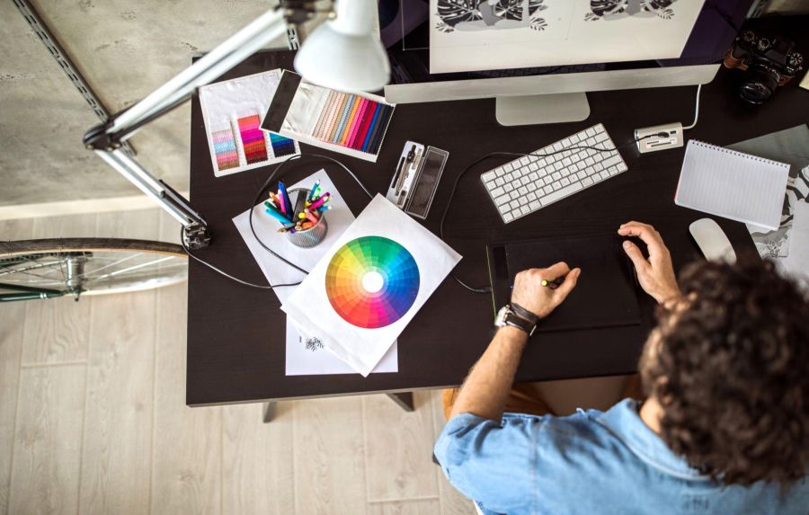
Color psychology taps into how colors can evoke emotions and influence behavior. This concept plays a significant role in web design, as colors can subtly guide users on a website, encouraging them to take specific actions. The idea is not just about aesthetics but about understanding how different hues can impact a visitor’s perception and decisions. For businesses in Houston, tailoring color choices to align with local preferences and audience expectations can make a substantial difference.
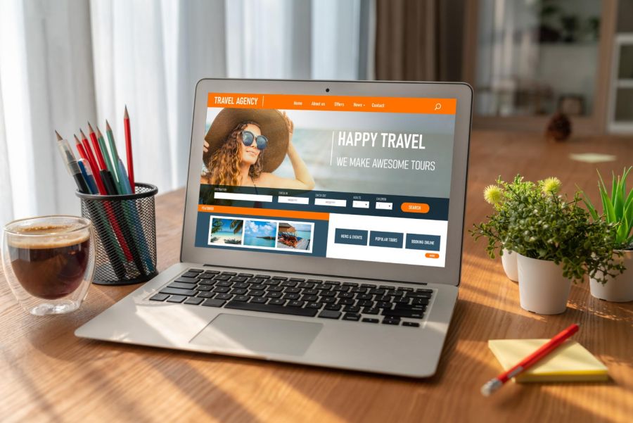
Consider a Houston bakery wanting to enhance its online presence. By strategically using warm tones like orange for a sense of warmth and friendliness, the bakery can entice users with a feeling of closeness and enthusiasm. These warm hues can encourage visitors to engage more deeply, perhaps clicking through to explore menu options or sign up for updates. This example shows how the thoughtful use of color can transform a website from a simple digital presence into a dynamic tool for engaging and connecting with an audience.
Understanding Color Psychology in Web Design
Color psychology involves understanding how colors can influence people’s thoughts and actions. Each color can invoke a different feeling or reaction, and using these insights can enhance a website’s effectiveness. This concept applies particularly to primary and secondary colors, each provoking unique responses.
– Red: Often associated with urgency and excitement, red can be compelling in calls to action, encouraging quick decision-making.
– Blue: Linked to trust and reliability, blue is frequently found on corporate or financial websites where professionalism is key.
– Green: Known for its association with calmness and health, green works well for eco-friendly or health-focused companies.
– Yellow: Evokes feelings of optimism and cheerfulness, making it suitable for brands wanting to convey positivity.
– Purple: Often connected with luxury and creativity, appealing to an audience seeking something refined or unique.
– Black: Represents sophistication and elegance, used by premium brands looking to convey a sleek and modern image.
By recognizing these effects, businesses can select colors that resonate with their audience, convey the desired brand message, and effectively drive desired actions. This strategic use of color helps create a cohesive and engaging user experience that not only attracts visitors but encourages them to follow through on calls to action.
How Different Colors Influence Website Visitors
Colors are powerful communicators, subtly directing user attention and driving action in web design. Picking the right color can create an emotional connection with visitors, aligning with their immediate needs and inclinations.
1. Red is all about urgency and excitement. It’s a great choice for highlighting calls to action like “Buy Now” or “Sign Up” that need immediate attention.
2. Blue stands for trust and reliability, making it popular among financial institutions and corporate websites where clients expect a sense of security.
3. Green connects with calmness and health, ideal for eco-friendly brands or wellness sites that want to emanate a feeling of natural harmony.
4. Yellow brings out optimism and energy, fitting for brands that want to create a cheerful user experience.
5. Purple symbolizes luxury and mystery, appealing to audiences looking for something unique and opulent.
6. Black conveys sophistication and elegance, often used by high-end brands aiming for a polished, modern image.
Choosing the right color combinations based on these insights helps in crafting a user experience that not only looks good but also feels right.
Practical Tips for Implementing Color Psychology in Web Design
Effectively using color psychology starts with understanding your brand and audience. Here are some actionable tips:
– Choose a Color Palette: Know your brand’s message and the audience’s preferences. Pick colors that express the brand’s personality and resonate with the target audience.
– Balance Colors for Readability: Ensure text contrasts well with the background to enhance readability. Use contrasting colors for easy reading and focus.
– Strategic Use for CTAs: Different colors work best for different actions. Colors like red or orange can make call buttons stand out, promoting faster responses.
– Use Consistent Color Schemes: Keep consistent hues across all your digital platforms. This helps in strengthening brand identity and recognition.
Adapting these strategies ensures that the design doesn’t just appeal visually but also becomes a seamless part of the user’s journey on the site.
Encouraging Desired Actions Through Smart Color Choices
Effective color use in web design can significantly affect how users interact with a website. By choosing appropriate colors, businesses can speak to their audience at an emotional level, sparking desired reactions and promoting engagement. Using color psychology well means crafting a visual experience that is both appealing and functional. Symbolically aligning colors with the brand message helps create a memorable journey for users.
Getting this right involves creativity and understanding of behavioral cues. By following best practices, not only can a business engage users effectively, but it also ensures that actions like clicking buttons, exploring pages, or even making a purchase are instinctively driven by the way colors are strategically laid out. Exploring tips on color use can unlock new potentials for engaging users and heightening the impact of a website.
Looking to make a bigger impact with your web design in Houston? BK Design Solutions is here to help. Discover how our team uses the power of color psychology to build websites that resonate and engage. Check out the opportunity to get a professional 4-page website for free and take your online presence to the next level.


