Houston Website Design Strategies to Boost Your Sales

Standing out from the crowd gets harder with every new business that launches a website and other digital assets. Visually-appealing websites aren’t enough anymore. Your Houston website design must include functional and intuitive design features to draw your ideal customer in.
If one of your objectives for having a website is to boost your sales, some design techniques are more effective than others.
In this blog, we explain 5 of the most proven website design strategies specifically tailored to increase sales. Unlock your brand’s sales potential with:
- Clear and intuitive navigation
- Responsive Houston website design
- Compelling visuals and imagery
- Social proof and testimonials
- Streamlined checkout processes
1 – Clear and Intuitive Navigation
When planning your Houston website design, clear and intuitive navigation is among the most important aspects to include. Visitors to your website leave in a hurry if they can’t easily find what they need. If they click out of your site before making it past your home page, search engines might give your site a negative rating for user experience, which hurts search ranking.
Some effective strategies that help website visitors navigate through your content effortlessly include:
- Organizing the menu structure. Start by designing a logical and well-organized menu. Categorize your content into main sections and subcategories as needed. Make sure your menu labels are descriptive and easy to understand. Brevity is best, so stick with short names for menu items. Avoid overwhelming your visitors with too many menu options. Stick to a hierarchy that’s easy to follow and helps users anticipate where to find specific information.
- Using descriptive and consistent labels. Never use vague or generic labels for your navigation links. They should be descriptive and reflect the content they represent. Use clear and specific wording. Make sure labels are consistent across your website so guests can quickly recognize and understand your navigation patterns.
- Installing a search bar feature. Including a search bar function prominently on your web pages enhances navigation. Users can quickly and easily find specific content by entering relevant keywords. Consider using autosuggestions to assist users in refining their search queries for the best outcome.
- Leaving breadcrumbs. These secondary navigation tools show users the path they took to get to their current destination. It helps them understand the website’s structure to allow for easier navigation back to previous pages or sections. Display the breadcrumbs prominently near the top of the webpage. Most web designers position them just below the main navigation menu.
- Optimizing for mobile devices. More than 90% of the global population accesses the internet using their mobile devices. Using a responsive design that automatically adapts to screen size improves the user experience.
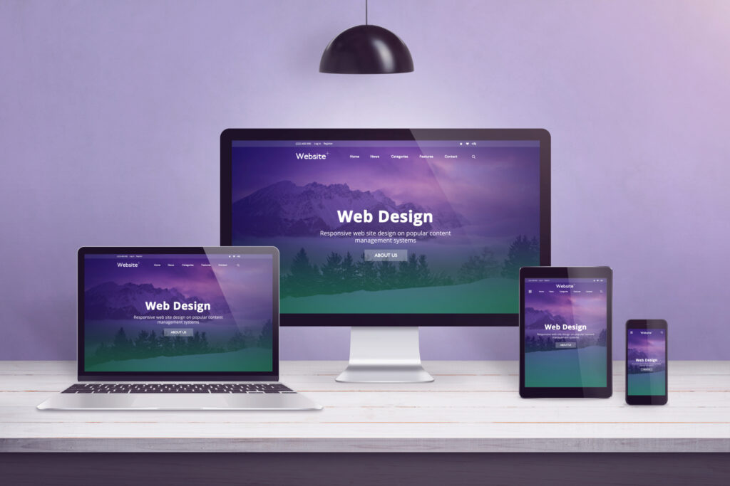
2 – Responsive Houston Website Design
Optimizing webpages for mobile devices is an important part of creating a responsive website design. The last thing you want is for someone to visit your website on their mobile phone and encounter font that’s too small to read and images that take forever to load.
Your web designer can take certain steps to ensure your website is responsive and improves the user experience. Some of the key steps they should take include:
- Use responsive frameworks or grid systems. Responsive frameworks or grid systems provide a solid foundation for responsive website design. They help web designers create a responsive layout more efficiently.
- Implement media queries. Media queries are CSS rules that allow the application of different styles based on the characteristics of the device or screen size. You can use media queries to define specific breakpoints where the layout and design of your website adjust to fit different screen widths. You can modify the size, position, and visibility of elements to ensure optimal display on various devices.
- Include fluid layouts. Fluid layouts use percentage-based widths instead of fixed pixel widths. This allows your content to automatically resize and adapt to different screen sizes. Using relative units like percentages instead of fixed pixels allows elements on your website to adjust proportionally based on available screen space.
- Upload flexible images and media. Your website designer should use CSS to set the maximum width of images to 100% to ensure they scale down proportionally on smaller screens without causing overflow or distortion. Some HTML attributes serve different image sizes based on a device’s resolution.
- Incorporate a mobile-first approach. Designing with a mobile-first approach means starting the design process by prioritizing the mobile experience first. Then, your web designer progressively enhances the site for larger screens. Approaching your website design this way focuses on a streamlined experience for mobile users. Considering most people these days access the internet from their phones, it’s a smart approach.

3 – Compelling Visuals and Imagery
The human brain processes images 60,000 times faster than text. Strategically placing compelling images and other visuals on your website significantly impacts your sales potential.
However, you must strike a balance to ensure you’re not overusing visuals, which can slow down webpage loading times and negatively affect the user experience.
Some steps your web developer must take to satisfy this aspect of web design include:
- Use professional, high-quality images. All product images must be clear, well-lit, and showcase the details from different angles. Use the zoom function or provide multiple images to give visitors a 360-degree visual of your products. The more appealing your product images are, the more likely visitors are to complete the sales transaction.
- Incorporate lifestyle imagery. When possible, showcase your products or services being used in real-life situations. Doing so helps customers envision themselves using your products, creating a stronger connection.
- Create a visual story. Use visuals to create a narrative about your brand, products, or services. Highlight your unique selling proposition through a combination of images, infographics, and videos that tout the benefits, features, and transformational aspects of your offerings.
- Call-to-action visuals. CTA visuals like buttons or banners grab attention. Use contrasting colors, enticing imagery, and persuasive copy to encourage visitors to take a desired action.
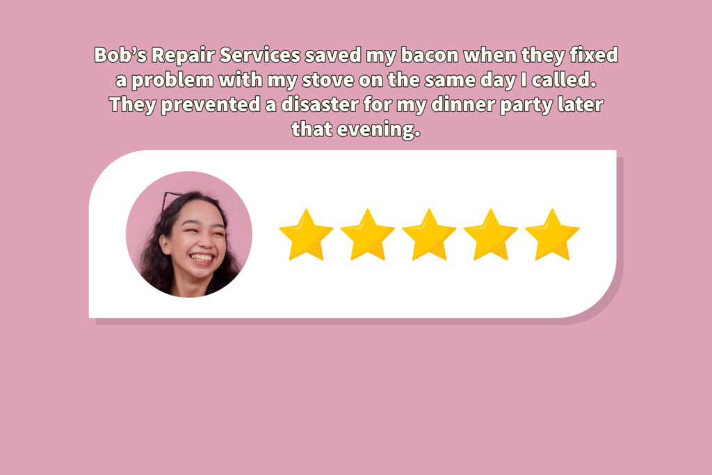
4 – Social Proof and Testimonials
Social proof is an absolute must with your Houston website design strategy. Showcasing customer testimonials, reviews, or user-generated content in the form of images or videos builds trust with your target audience.
Some of the ways you can incorporate social proof on your website include:
- Customer testimonials. Don’t just show text quotes from customers praising your brand and its products or services. Go the extra mile by having them give their testimony in a video clip you can then strategically place on your website. Make sure they tell a story about how your product or service solved a problem for the best results.
- Case studies. In-depth case studies demonstrate how your products or services solved specific challenges for your customers. Make sure your case studies provide detailed insights into the value and effectiveness of your offerings.
- Influencer endorsements. Industry experts and influencers lend credibility to your products or services. Partner with them to promote your offerings on their social media and other digital assets. Share their endorsements on your website.
- Trust seals and certifications. Displaying trust seals and certifications from recognized organizations instills confidence in potential customers. Flaunt them if you’ve got them.

5 – Streamlined Checkout Process
If your customers can buy your products or services directly from your website, then a streamlined checkout process is a must-have feature. You don’t want prospective customers to abandon the process midway through it. Here are some techniques your website designer can use to reduce friction and increase conversion rates.
- Simplify forms. Minimize the number of form fields required for checking out. Only request essential information for processing the order, such as shipping address, payment details, and contact information.
- Provide options. Don’t force customers to create an account to do business with your brand. Give them the option of a guest checkout that eliminates the need to go through the registration process.
- Indicate progress. Provide clear progress indicators during the checkout process so users know how many steps they must complete.
- Incorporate auto-fill and auto-complete. Help your customers save time by implementing auto-fill and auto-complete functions on your website that allow them to quickly populate checkout sections with information previously used.
- Secure payment options. Using popular and trusted payment gateways provides reassurance to users and encourages them to complete the checkout process.
- Generate an order summary and confirmation. When the customer has successfully completed the buying process, provide a summary of their order and confirmation of its placement. The last thing you want is for someone to think they finished placing their order when they missed a critical step for completion.
Houston website design for all brands
Whether you have an e-commerce business or a traditional brick-and-mortar storefront, you need a Houston website design professional who can elevate your brand to boost your sales.
BK Design Solutions has a proven track record of building high-conversion websites. Give us a call today to schedule a consultation with one of our team members to learn how we can help you reach your sales goals.
Houston Website Design, web design agencies, website designer Houston, website developer